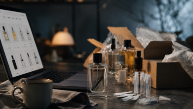
When a shopper spends on a premium product, the box is the first promise of what is inside. It should feel solid in the hand, open with ease, and signal taste before a single logo appears.
Excellent luxury packaging is not loud; it is intentional. The right structure, material, and finish can turn a simple container into a keepsake that stays on the dresser long after purchase.
Choosing a box style is about understanding the expectations of high-end clients and shaping them into a tactile, memorable experience. Looking for styles to make your box look luxurious? You landed on the right blog. Read more to learn more!
What High-End Buyers Expect From The Unboxing?
Luxury customers look for weight, precision, and quiet confidence. Hinges should align perfectly. Lids should lift with a soft pull rather than a squeak. Magnets should close with a gentle click, not a slam. Inside, fabrics and inserts cradle the item with care. When these details work together, the box becomes part of the product, not just its means of transport.
If you are mapping a box design for project timelines, start by defining the sensation you want at each step: the first touch, the opening gesture, the reveal, and the after-use value. Many brands partner with a luxury box company early, allowing structural engineers and designers to align feasibility with ambition.
Signature Structures That Make a Lasting Impression
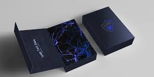
One timeless option is the rigid drawer gift boxes style. A ribbon or die-cut notch invites the customer to pull the tray outward, creating a slow, cinematic reveal. The controlled friction of the tray adds to the sense of craft. This format works well for curated sets and limited editions because compartments can be arranged like a boutique window inside the box. Many brands choose this style when they want a luxury gift box that becomes a storied object with ongoing purpose. It is perfect for storing watches, stationery, or skincare refills.
Even with strong structures like these, brands should be aware of common design mistakes that weakens the whole impression. Issues like poor alignments, weak closure, or mismatched finishes can quickly affect the luxurious feel. To see how errors impact on customers’ experience, this resource on candle packaging mistakes will help you provide the insight that applies well beyond candles.
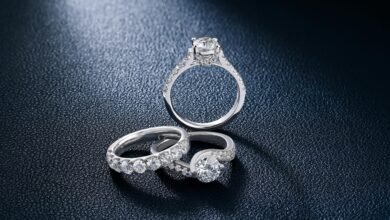
Round “hat” boxes give softness and romance to apparel, millinery, and delicate textiles. Their curved walls feel generous and display beautifully in a boutique. For travel-friendly durability, consider a double-wall setup with a snug lift-off lid and a fabric carry handle.
Unique shapes of boxes, such as trapezoids or hexagons, signal boldness and are ideal for fragrances or confections that lean artful and modern, though they require careful planning for palletization and shelf efficiency.
Collapsible rigid constructions can be game-changers for global programs. They ship flat to reduce freight volume, then pop into a sturdy shape at the fulfillment center. When engineered well, fold lines disappear beneath wrapped paper, and the final form looks fully rigid.
This balance between impact and logistics often makes luxury packaging for small businesses feasible at earlier stages of growth.
Materials and Finishes That Whisper “Luxury,” Not Shout it
Paper-wrapped rigid boards are the backbone of premium packaging, but the choice of paper is where character truly resides. Uncoated, tactile stocks feel warm and human; high-sheen papers read sleek and contemporary.
Subtle embossing or debossing adds dimension without clutter. Foil should be crisp and fine, not heavy-handed. A blind deboss—pressing a logo into the paper with no ink or foil can be
more powerful than metallic shine when the brand voice is restrained.
Inside, the insert completes the promise. Molded pulp lined with sueded paper balances sustainability and elegance. For jewelry, flocked or microfiber pads prevent slipping and scuffs.
Magnetic closures deserve special attention: choose magnet strength after testing with the actual product weight and insert resistance. A too-strong magnet frustrates; a weak one feels cheap.
Color, Typography, and The Art of Restraint
Box design art for luxury tends to favor limited palettes and immaculate typography. One or two brand colors, paired with tone-on-tone textures, can feel more expensive than a multicolor approach.
If illustration is central to the brand, consider wrapping the interior with art, leaving the exterior quieter. This creates a private moment for the owner at unboxing, which high-end clients appreciate.
Planning for Scale and Consistency
For brands moving from pilot runs to broader distribution, consistency is everything. Lock down dielines early and conduct transit testing before final approval. Colors should be specified with precise targets and tolerances, and you should request drawdowns on your exact paper. When ordering luxury packaging boxes wholesale, make sure that you receive production samples from the final line, not just pre-production mockups.
Cost Controls That Do Not Dull The Experience
You can protect budgets without downgrading the feel by focusing on one or two elements. For example, keep the structure simple but invest in textured paper and a crisp foil. Or choose a collapsible rigid form to reduce freight costs and allocate the savings to a custom insert. Another strategy is to standardize an outer shell across ranges and vary only the inner trays and papers. This modular approach enables a luxury box company to maintain speed while giving each collection its own distinct personality.
Bringing it all together
Ultimately, the best luxury box packaging design is the one that makes the receiver feel valued and considered. It guides the hand, protects the product, and leaves a reason to keep the box. Whether you lean into the calm precision of a magnetic book-style format, the stagecraft of a drawer reveal, or the romance of a round silhouette, treat every touchpoint as part of the story. Define the opening gesture, honor the product’s shape, and choose materials that age gracefully.